
saint michele
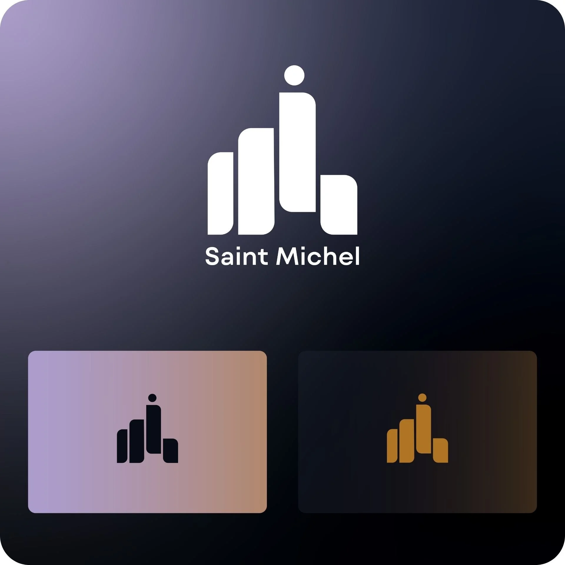
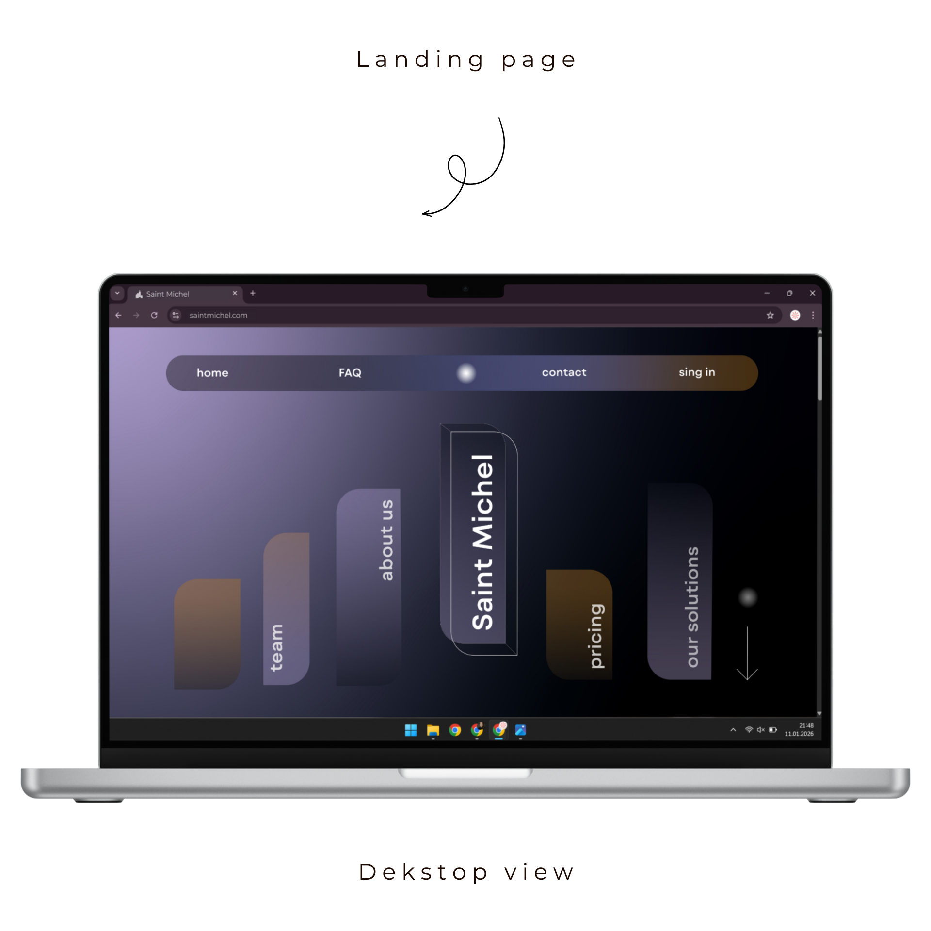
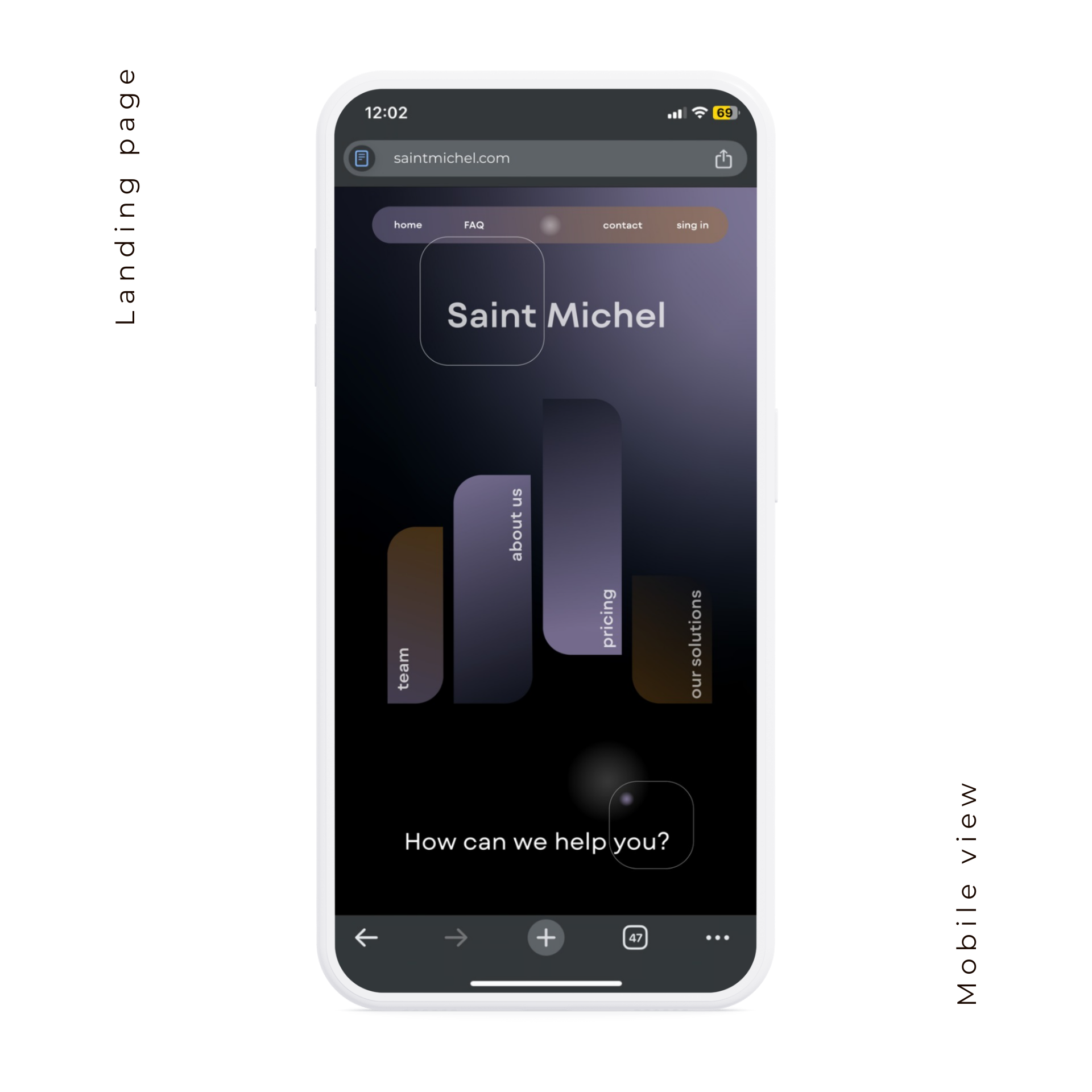
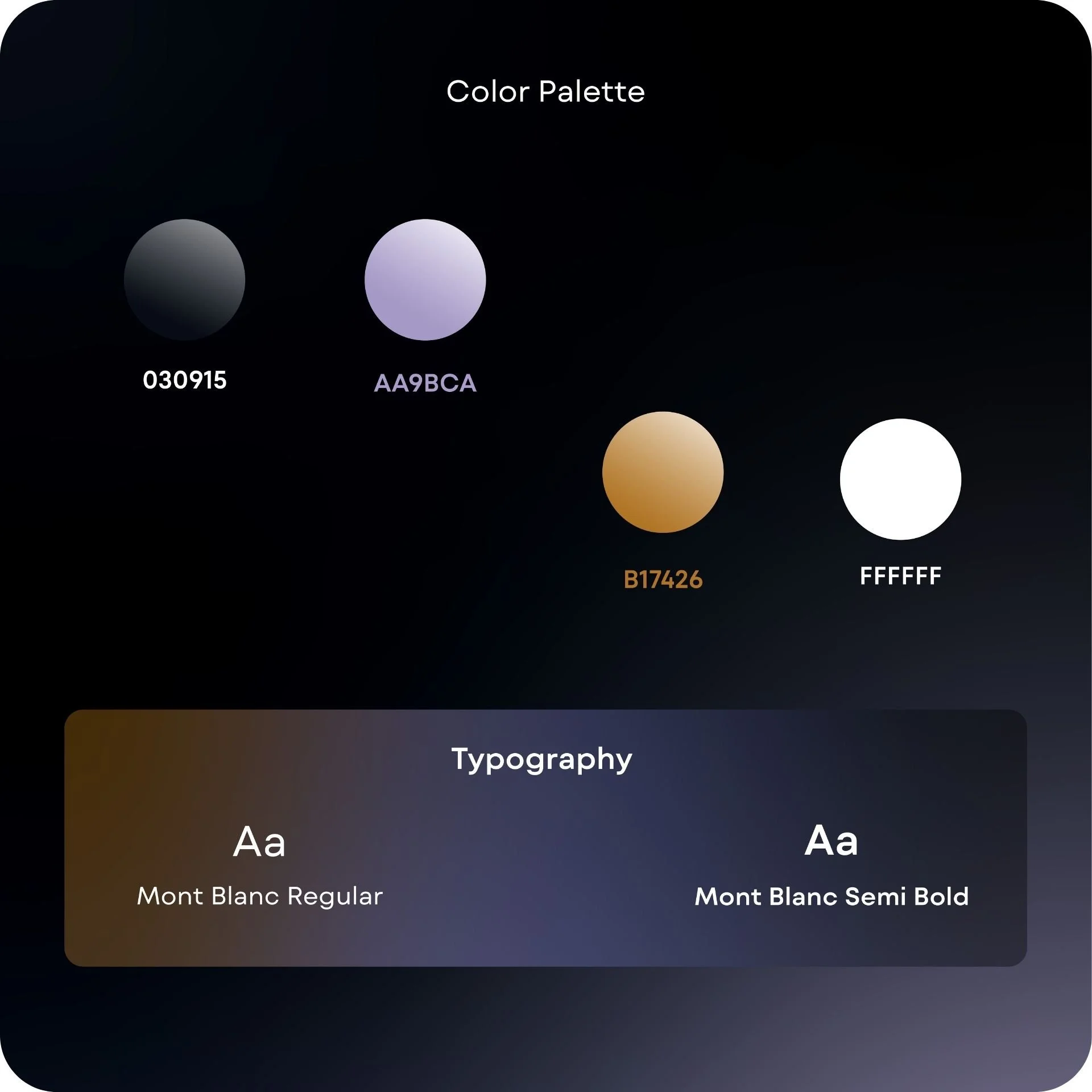
Another interesting project I had the chance to create is Saint Michel - a brand from the IT industry. The main idea of the logo was to shape it around the famous French monastery Mont Saint-Michel. The brand’s colors have two main connotations - dark yellow as a reference to gold and the sand color of the monastery, and dark purple as a color that brings a subtle touch of the tech and IT industry. The combination of the two creates a strong and memorable contrast.Furthermore, another project I completed for the brand was the design of a web and mobile landing page. The main menu is based once again on the shape from the monastery and the logo. The overall design communicates clearly to the audience which industry Saint Michel belongs to.
The branding is currently awaiting its official launch.