
POLOTY
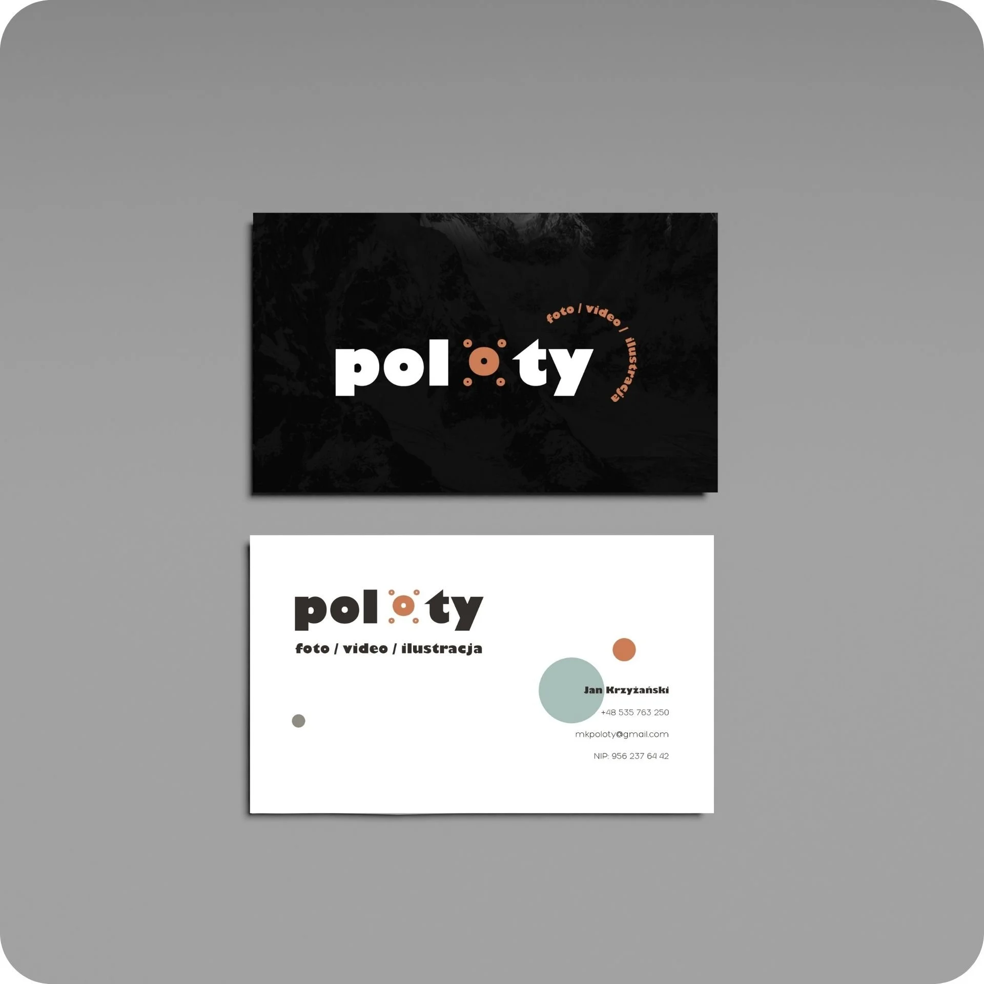
The logotype for Poloty, a content creation brand, was built around a drone — one of the main tools of the company. The shape and construction of the logo reflect the technical and dynamic nature of drone work, while keeping the overall feel clean and modern.However, the heart of the branding is the name itself, which in Polish is a language game — “poloty” can be associated with flying, making it a natural and clever fit for a drone-based brand. This double meaning gives the logo an extra layer of depth, connecting the visual identity with the soul of the brand.